In the series Typesetting TeXniques, we share our expertise as professional copyeditors and typesetters of mathematics. We frequently hear from authors that our work makes their papers better. This is how we do it.
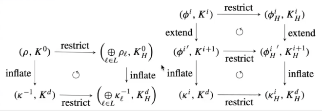
This pair of commutative diagrams was produced with the package tikz-cd:

The typesetting is good, but it could be better with a few small changes. Typically, map labels along arrows are in a smaller font size than the objects the maps go between:
$$ A \xrightarrow{f} B \xrightarrow{g} C $$
Contrary to this standard, the map labels “restrict”, “extend” and “inflate” are in the same size font as the objects. Also, the binary operator \oplus appears where the operator \bigoplus should be used.
In the video below, an MSP production editor identifies these and other points for improvement of the display and then makes them through small changes to the code. Some of the changes use features of the package tikz-cd, while others are TeX tricks for making small visual adjustments.
Whether or not you will end up adopting some of the tools and techniques we use to fine-tune displays with commutative diagrams, we invite you to take this behind-the-scenes look at how we at MSP make such displays publication-ready.
Watch the video #
Further reading #
You can get started with the tikz-cd package without prior knowledge of TikZ. The documentation for tikz-cd is here.
In the PGF/TikZ manual, you can find information about different kinds of arrows, including stealth arrows, in Chapter 16, and the TikZ matrix library is documented in Chapter 59.
The TeXbook by D. E. Knuth: See page 178 in Chapter 18 for descriptions of \phantom and \smash. See item 6 on page 435 in Appendix F for contrasts between symbols for “large operators” and their smaller counterparts.
Header image by Indra Projects, available from Unsplash. Free to use under the Unsplash license.